
Dec 10, 2022
Background
Tsukaikata-sapōto is a customer support service for a large Japanese mobile carrier. Its aim is to streamline customer service, help users diagnose tech issues, and increase their digital literacy through personalized content.
Our UX team felt that there was room for improvement in the design of the personalized content. There was also a gap in our app’s guidelines--our UI designers had UI guidelines, our content writers had writing guidelines, but we didn’t have design guidelines for the articles themselves, meaning that our writers and developer, who worked together to create the layout of new content, didn’t have a set of rules to follow and were often making design decisions without consulting each other.
The decision was made to catalog UX issues in our content and create the first set of UX content guidelines. All in all we published sixteen guidelines.
Date
October 2022 - December 2022
Client
KDDI
Product
Tsukaikata-sapōto (mobile app)
Team / Roles
As lead, I oversaw this project from start to finish.
The team was made up of the following:
Designers 3 (including me)
Writers 4
Developer 1
Primary Objectives
Evaluate personalized content and identify UX issues
Collaborate with writers and developer to identify areas of ambiguity
Keep the guidelines short and simple, and easy to reference
Secondary Objective
Promote the importance of usability and accessibility to client and project members
Process
Our process employed a flexible double-diamond approach, a method developed by the British Design Council. The double diamond is made up of two phases: a problem phase and a solution phase. In both, a period of expansion follows a period of narrowing focus.
Discover
UX Audit
To get a comprehensive understanding of the problem we were solving, we first conducted a UX audit. Our two designers and I gathered a few dozen articles that had been written in the past year and looked for problems regarding usability, accessibility, and inconsistencies in: design system, layout, non-text elements, and branding.
Writer Interviews
We then took our findings to the content creation team, and conducted a hearing to understand how the problems we discovered were occurring. This also gave us an opportunity to learn more about their writing and developing process, and to ask how they were making decisions when it came to design (use of colors, creation of images, etc.)
Define
Grouping Problems
We now had a wide range of issues that needed to be condensed and sorted. We grouped issues by category (layout, illustrations, margins, etc.), each containing subcategories of similar issues. This way, when we addressed the headers problem, for example, we also tackled a similar problem in which some headers were omitted at the beginning of a section.
The majority of problems pertained to one of the following:
Accessibility (poor color contrast, device responsiveness)
Inconsistent elements (ToC and hyperlinks were often handled differently from article to article, hindering user recognition)
Unconventional formatting/dated visual design
Writer ambiguity about design decisions
The scope of the project was thus set to include guidelines that would either clarify and confirm existing design or make changes to the existing design where needed, particularly in respect to accessibility.
Prioritizing
To determine scope, we prioritized issues based on their perceived impact and amount of effort required. High impact, low effort “easy wins” went to the top, and low impact, high effort “money drains” went to the bottom.
Buy-In
A final conversation with the content creation team to confirm the problem and direction of the task and we moved into the latter half of the double-diamond.
Develop
Ideating Solutions
Now that the problems and scope were defined and all stakeholders were in agreement, it was time to begin ideating solutions.
This phase consisted of a mixture of team ideation workshops, competitor analysis, and individual design sessions. It took a couple weeks, involved some back and forth among the designers, and required us to go back to the writers to clarify feasibility as we came up with potential solutions. These solutions came from a variety of sources:
Industry trends
Other areas of the Tsukaikata-sapōto app
Web accessibility standards
On the following pages, three finalized guidelines are presented that represent the above.
Deliver
Hyperlinks
Our audit highlighted the need for a guideline regarding the handling of hyperlinks. Various colors and formatting were being used to indicate hyperlinks of the same type, and there were several cases of insufficient color contrast.
As the lack of consistency could prove a hindrance to user recognition, we initially discussed using a blue from our design system for all hyperlinks, as blue is a color most users associate with hyperlinks. Initially proposed to preserve aesthetic conformity, the blue failed contrast checks when placed on our light blue and light teal backgrounds, so was eventually replaced by #0000EE, a color frequently used around the web due to its high visibility.
An underline was added to help users who have difficulty interpreting colors, so as to not solely rely on color for identification. Though underlined links are typically reserved for web-based content, it was important to us to take the guess work out of our UI as much as possible, as a number of our users are not highly tech-literate.
Finalized Guideline
Use the following styles for hyperlinks:
(Left) An underlined #0000EE for hyperlinks in body text
(Right) An underlined au Orange for hyperlinks in non-content elements such as cards

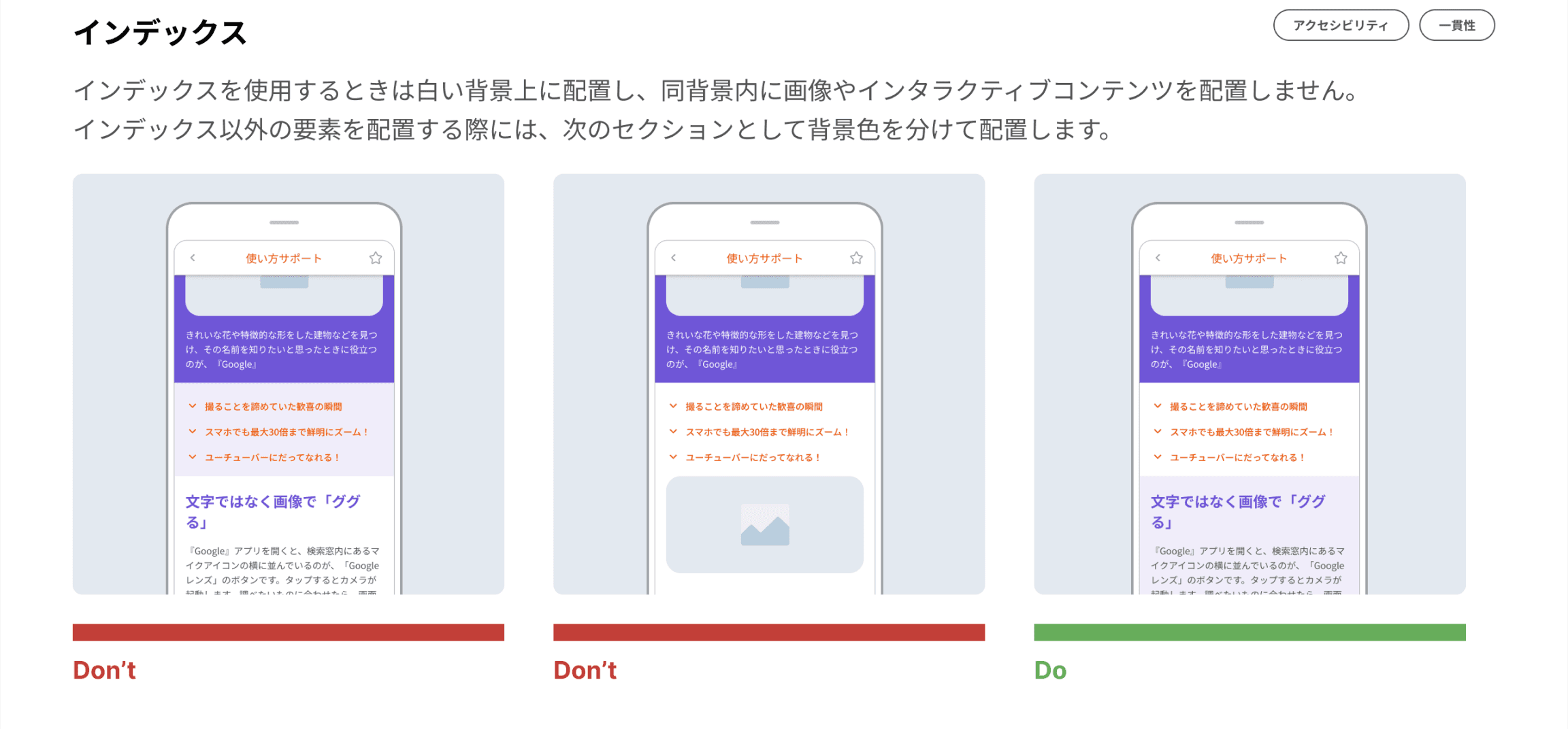
Table of Contents
As mentioned previously, the table of contents section suffered from a lack of uniformity that could potentially be jarring to users. We asked ourselves the question: If something I use everyday suddenly looked completely different one morning, how long would it take me to realize what it was? Repetition is a crucial design fundamental that teaches users what a recurring element is and how to use it.
Our competitor analysis showed that the majority of apps and blogs that used a ToC kept their design simple, almost boring, without too much attention drawn to it, allowing the content to shine and the ToC to be recognized as a navigational feature.
Finalized Guideline
Place ToC alone on a white background, without the use of images or interactive content. Include such elements in a new colored section instead.
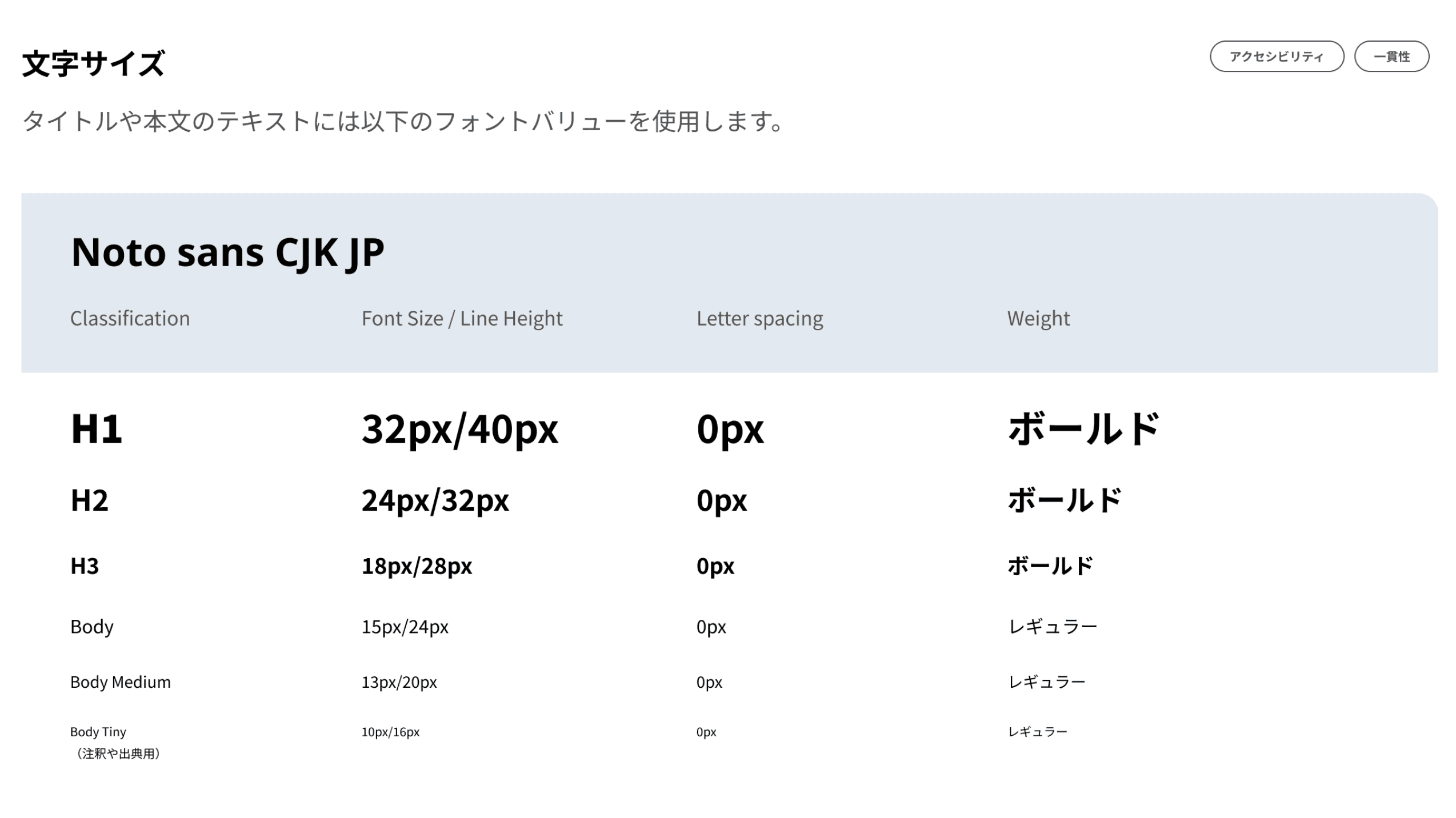
Text Size
As the H2 headers were written in color and the H3 were in black, there was likely already enough visual hierarchy differentiating the two from a user’s perspective. However, increasing the hierarchy by decreasing the H3 size removed ambiguity in the writers’ room, and led to creation of a writers’ guideline stating to always use an H2 after an H1.
Finalized Guideline
Use the following values for headers and body text:
Change: H3 font size 20px → 18 px
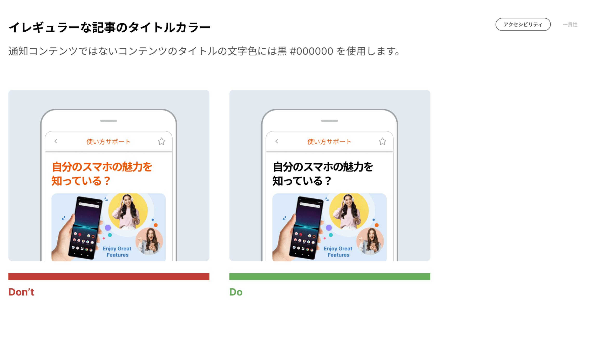
Client Agreement
After some fine-tuning with the writers, we presented our guidelines to KDDI. They were in agreement regarding most guidelines from the start, but a bit of dialog was necessary to clear up some points, such as the below guideline which recommended changing the title text color from the brand’s highly recognizable au Orange to black. The client feared that this would diminish the app’s bright and happy brand image, so I presented them with a failed color contrast check that showed that the orange could be difficult for some of our users (many of whom are elderly and have expressed difficulty reading our text in usability tests) to read comfortably.
I also provided a few examples of special “irregular articles” from our app that used a charcoal grey text for titles, showing that the cheerful image could be maintained with the right choice of illustrations and copy, and they agreed to move forward with the change.
Future
Handoff & Adoption
This set of guidelines has now been officially approved and installed in our content creation team’s process. However, how quickly and effectively they are implemented remains to be seen. Our UX team is still in communication with the writers and developer as they get accustomed to the new guidelines.
A Living Document
Low priority and/or large-scale issues that were not included this time will be addressed in a later phase. We also plan to conduct quarterly UX audits and communicate with writers in order to detect future issues as they appear, and use future usability tests as an opportunity for validation.
Want to hear more?
Send me a message on LinkedIn and we can set up a call to talk about how this approach could work for your business.