
Jan 8, 2024
Design systems are crucial to any large organization with a robust design team, but careful planning and management of UI assets is important for companies of any size, and can set design and dev teams up for success as the company expands its services and grows its staff.
As I was getting acclimated to the products I would be working on at in my new role at CogSmart, one of the first goals I set for myself was to clean up the design documentation. UI components weren't listed anywhere, no rules existed on to use them, and colors were undefined and in need of simplification.
I started by doing an audit of each product individually, taking note of things like:
UI components
Colors
Fonts and stylings
Page layouts
Any patterns I could find in how things were being used
There was room for improvement. Design work had until then been handled by various contractors, developers, and product members, sometimes without proper crossover periods or clear documentation to guide them.
BrainSuite in particular, an MRI analysis system for doctors and technicians (and our core product), was one product that was in need of attention. New flows were often made without reference to existing patterns and components, resulting in things like:
Undefined typography
Inconsistent state styling
Unclear task hierarchy, resulting in different types of buttons being used for similar actions and secondary or tertiary tasks mapped to primary buttons
Several modal styles and layouts
Many similar colors being used
Insufficient color contrasts
Making the rounds
I took what I had found and set up meetings with our relevant stakeholders, shared my findings, and listened to some stories. Apparently, new UI releases sometimes resulted in a number of customer complaints. Internally, most people were in agreement that usability of the product was generally low, though they couldn’t necessarily say why. A couple developers also admitted to struggling in managing the sheer amount of variation in styling and components, particularly when just joining the company.
I planted a few seeds during my talks, explaining why consistency in visual language is so important. (The answer: we want to ensure that users can pick up on new flows without difficulty) I also made sure to mention that we should start documenting this somewhere central to save ourselves some time down the road.
Let’s just…start
Going back to the drawing board, I considered our problems and goals.
Even though I was the only designer, I knew that everyone from the product team to the sales team to the engineers themselves had become accustomed to contributing to designs, and that there were strong opinions in all departments about what was best for our system. In other words, I would be creating the designs, but I wouldn’t be able to get buy-in on some small fixes that I felt were necessary without a good reason.
So I saw my goals as the following:
Create documentation to simplify my job when making new designs
Establish common vocabulary to discuss future design proposals with non-designers
Reduce workload on devs by recycling styling and components
Starting
Version 1.0 of our quasi-design system was just to be the start of a document that we would add to as we grew.
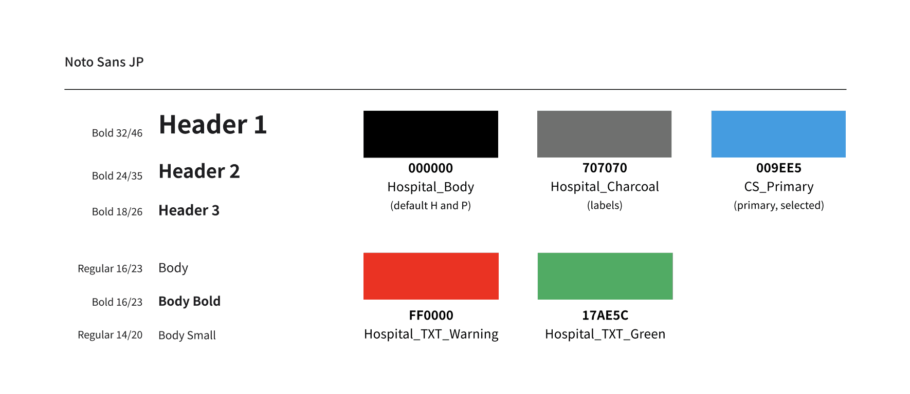
I worked with one of our front-end developers to create tokens. We reduced the dozen or so greys used on the site to four and darkened the primary blue to WCAG standards.. We cleaned up the myriad typography styles and defined patterns that could be recycled throughout pages.
Components and icons taken from MUI (because our devs are familiar with it)
Language guidelines (for me mostly, but they helped when group problem-solving with the PRD team)
Use verbs in x, nouns in y
Put the primary button on the left/right
We’re already seeing progress
As a result of these efforts, we saw the following improvements:
Our design and dev process increased in efficiency and our team communication got better, as we were using the same terminology.
When little fixes were required, I could now give verbal instructions to engineers so they wouldn't need to wait for a Figma. I could say something like: “Let’s go with a side-by-side confirmation modal with warning text for this. Make 'cancel' the primary action and 'overwrite' the secondary.”
Only the start
What we now have, I like to refer to as a quasi-design system. It’s simple and rudimentary, but it brings our process logic, order, and efficiency to our process.
We’ll contribute to it as we continue to grow our system, and we’ll also get some user feedback on contentious patterns during our UX redesign scheduled for Fall 2024.
Want to hear more?
Send me a message on LinkedIn and we can set up a call to talk about how this approach could work for your business.