
Jul 28, 2022
Background
With over 3 million subscribers, many who rely on the tsukaikata-sapōto app are over the age of 50, a demographic that requires a simple and accessible app to help them with their tech problems. Much of the app’s content includes interactive sections like quizzes meant to get users more familiar with their digital devices, but usability issues and inconsistent design meant the app was failing this group of lower-literacy users.
With a project-wide effort to make tsukaikata-sapōto more of an educational tool for our older users, the decision was made to give our interactive content a redesign.
Objectives
Address usability issues
Increase user interaction with content
Link content to user digital literacy
Make content UI more consistent with app UI
Client
KDDI
My Role
As the lead UX Designer, my responsibilities included planning, defining objectives, leading ideation workshops, designing usability tests, making prototypes, delegating tasks, and meeting deadlines.
Process
Research
We began by gathering data from usability tests, conducting a UX audit, and running a competitor analysis.
Definition
We then identified the weaknesses of our existing UX and redefined our objectives.
Ideation
Being a collaboration-heavy team, we held workshops to ideate and designate tasks with the goal of redesigning our content.
Research
Usability Testing
We conducted usability testing on a range of existing interactive content to see how they held up with new users. We found that:
Many users were not interacting with content (4 of 6 users did not notice horizontally-scrolling instructions).
Playable content like embedded YouTube videos were noticed by users.
Users typically enjoyed the content that they did interactive with.
UX Audit
We also conducted a UX audit, consisting of two parts:
1. Three designers inspecting the interactive content while referencing usability heuristics. Notable areas for improvement included: improving user feedback, clarifying visual hierarchy, and decreasing cognitive load.
2. Interviewing other teams on the project (Customer Care, Content Creation, Product Analytics, Product Managers). These interviews gave us a variety of perspectives and presented us with data that we previously didn’t have access to.
Competitor Analysis
Finally, a competitor analysis gave us insight into industry standards and potential solutions to the issues our app faced. We primarily focused on apps heavy in personalized content and quiz-based apps. YouTube, Google’s Word Choice, and Sporcle are three that we drew inspiration from for our final designs.
Definition
Once we had our data, we looked for areas of overlap between our users’ needs and our client’s goals. Then we identified where the app was failing to meet these goals. This allowed us to sift through the wealth of data and focus in on the most relevant insights.
During our Ideation phase, we kept our sights on the following big-picture goals:
Communicate user tasks more clearly. CTAs should be obvious.
Decrease cognitive load.
Improve accessibility (design to the persona with the most needs).
Drive user engagement and link the quizzes to the greater goal of achieving digital literacy.
Ideation
Swipe Function
As two-thirds of users tested were not engaging in our horizontally-scrolling content, such as this instruction screen. We hypothesized that the UI could be adjusted to compel users to scroll.
Measures to ensure app consistency* were also necessary.
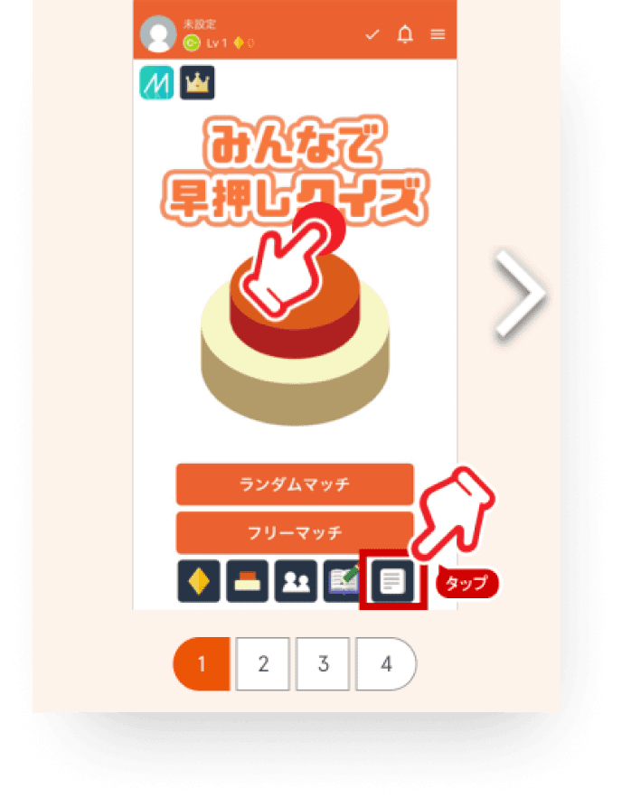
Red, heavily-stroked hand icons were inconsistent with overall app design.
In the final design, we:
Added a white transparent layer.
Made the hand animation larger and clearer to establish hierarchy over the embedded hand.
Added a text prompt to swipe.
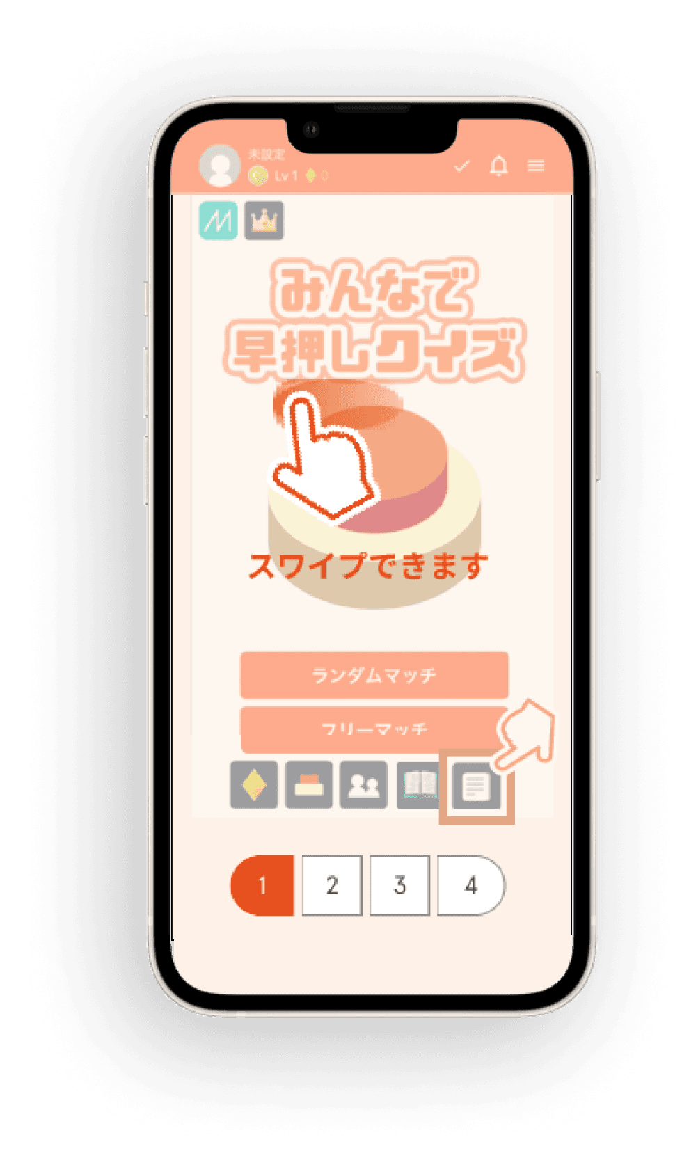
Final design
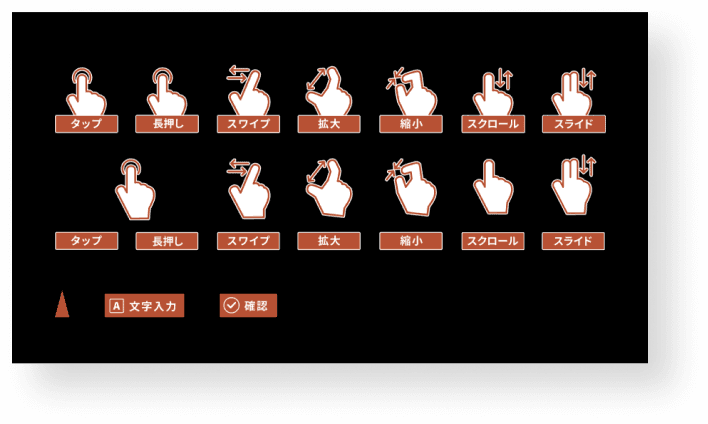
Set of gesture icons used throughout the app.
Quiz Start Card
One of the most critical steps in the user flow is the “start card”, which encourages users to stop reading and take a fun quiz to boost their understanding of the article’s topic. Without a clear CTA, users will scroll past and miss out on the embedded content, wasting a crucial learning opportunity to improve their digital literacy.
Before
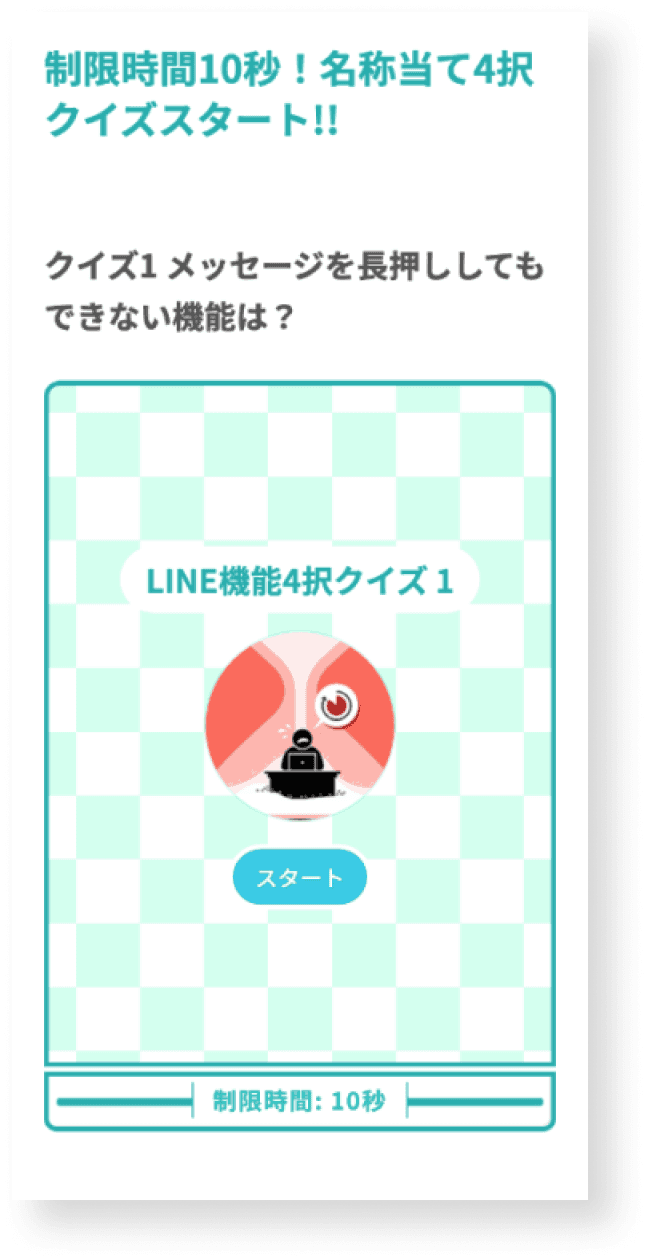
Our audit revealed the following issues with the current UI.
The screen felt cluttered without any clear visual hierarchy.
Not all devices displayed the entire start card and its instructions on one screen. This meant users might need to scroll up and down when first viewing the card.
The visual style was not in line with the rest of the tsukaikata-sapōto brand.
The checkered background made it difficult to see the overlayed text and start button.
After

The start card was made smaller to fit on any device screen.
Icons, colors, and textures were updated to be more consistent with the brand.
A large, high-contrast CTA was placed on a solid white background.
Text sizes were adjusted to better communicate hierarchy.
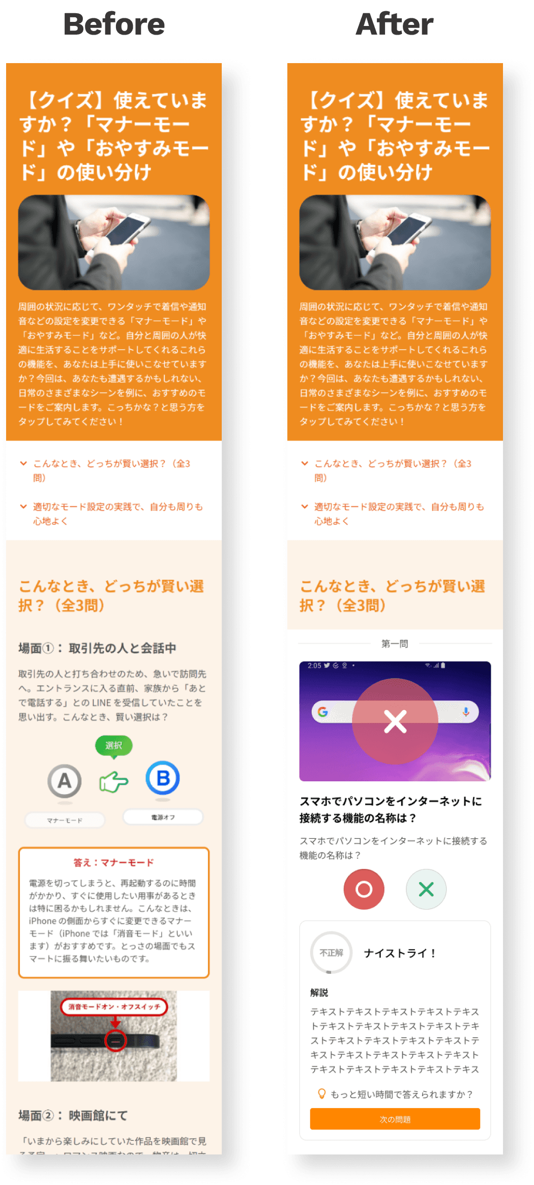
A/B Quiz
The A/B quiz is a quiz that asks users a question and presents them with two potential answers. Once users make a selection, they are given an explanation of the correct answer. Issues identified include the following:
No user feedback is given regarding the selected answer (correct answer is indicated, but not whether the user answered it correctly).
Cluttered UI with lack of clear visual hierarchy.
Users must manually scroll down to get to the next question.
Perhaps above all, no clear direction is given to users about how or why to complete the quiz-completing the quiz only displays a short assessment. We needed a way to tie their efforts to their ultimate goal of increasing their digital literacy.
The redesign addressed these issues by:
Creating a card interface to clearly demarcate quiz boundaries and focus user attention.
Providing users with feedback on their answer via color, animation, and an explanation card below that includes directly stating “correct” or “incorrect” and an encouraging comment. Redundancy via multiple feedback indicators was intended to be clear to all users (such as those with difficulty reading text or with red-green colorblindness).
Quiz Result Card
One of the main issues that users had when using our quizzes was understanding how they were being evaluated. They were presented with 1-5 stars and accompanying text, but since many users were not thoroughly reading the instructions (which explained that completing the quiz quickly will result in more stars), we needed to communicate this in another way.
The redesigned interface did this by addressing the following:
Converting the ambiguous star system to a more precise point system.
Adding a high-contrast bar that decreases with time and changes color from green to red, signifying a timer.
A descending score counter was placed next to the timer bar.
Animations were added to the score counter when an answer is selected, bringing attention to the score and adding a visual component when communicating whether an answer is “correct” or ”incorrect”.
Simplifying the interface to give the above points prominence.

Future
Validation
Making validation a standard part of our design process is part of an ongoing effort to improve the UX maturity of our organization. Once development is complete, our redesigned content will undergo usability testing to determine areas of improvement for the next cycle.
Phase 2
The process outlined in this case study was Phase 1 of a 2-phase project. Phase 2 is currently in the planning stages and will seek to expand our range of content to include more varied interactive content.
Driving User Literacy
As user literacy is a key business objective for the tsukaikata-sapōto project, being aware of our users’ literacy and designing the app to cater to their needs is central to our mission to support them in an age defined by its increasing digital complexity. Concepts that emerged from this project, such as recommending additional quizzes upon completion (left), will be used in other areas of the app to help drive us closer to this goal.
Want to hear more?
Send me a message on LinkedIn and we can set up a call to talk about how this approach could work for your business.