
Oct 10, 2021
Background
SenSay, a Japanese language-learning software that allows users to practice listening to and responding to questions in Japanese, was not meeting its business objectives. About a year after being launched, disappointing sales figures resulted in the project changing hands in the hopes of increasing sales.
A few months after inheriting the project and becoming lead (and more lackluster results), I made a proposal to halt sales, conduct UX research, and give the product an overhaul, under the hypothesis that we were spending our time developing a product that didn’t satisfy a user need, and that the resources allotted to reaching the initial vision of the product were better spent considering how to better cater to foreign nationals in Japan who needed a way to practice their Japanese conversation.
As a result, SenSay became the first UX project undertaken at GDI.
Objective
“Why are trial users losing interest?”
Investigate user needs
Assess user experience and identify usability issues
Rebrand and redesign, addressing usability and improving aesthetic
Process
Research
User interviews and usability testing were conducted to uncover user insights and identify UX issues.
Definition
These results were referenced across data from a competitor analysis and heuristic evaluation. A baseline was created for later reference.
Ideation
With the goal of improving usability and aesthetics, mockups were made.
Prototyping / Testing
Prototypes were then created to be measured against the previous design’s baseline performance.
Research
Usability Interviews
Interviews doubling as usability testing were conducted face to face with foreign nationals residing in Japan, all of whom were studying Japanese at the time.
Japanese Level: Daily conversation to business proficient
Ages: 24-35
Occupations: Tech, education, and service industries
Number of participants: 4
Usability issues were prioritized by severity. Only issues with both high frequency and high impact were addressed by the first set of implementations. The flow chart above shows the process by which issues were categorized, and the table on the left shows the final prioritization.
Definition
Results
The four highest priority (most severe) issues are displayed in the usability dashboard below. The usability metrics used to measure the system were defined as follows:
Effectiveness: Task Completion Rate (%)
Efficiency: Task Completion Time vs. Expert Task Completion Time (%)
Satisfaction: System Usability Scale (points)
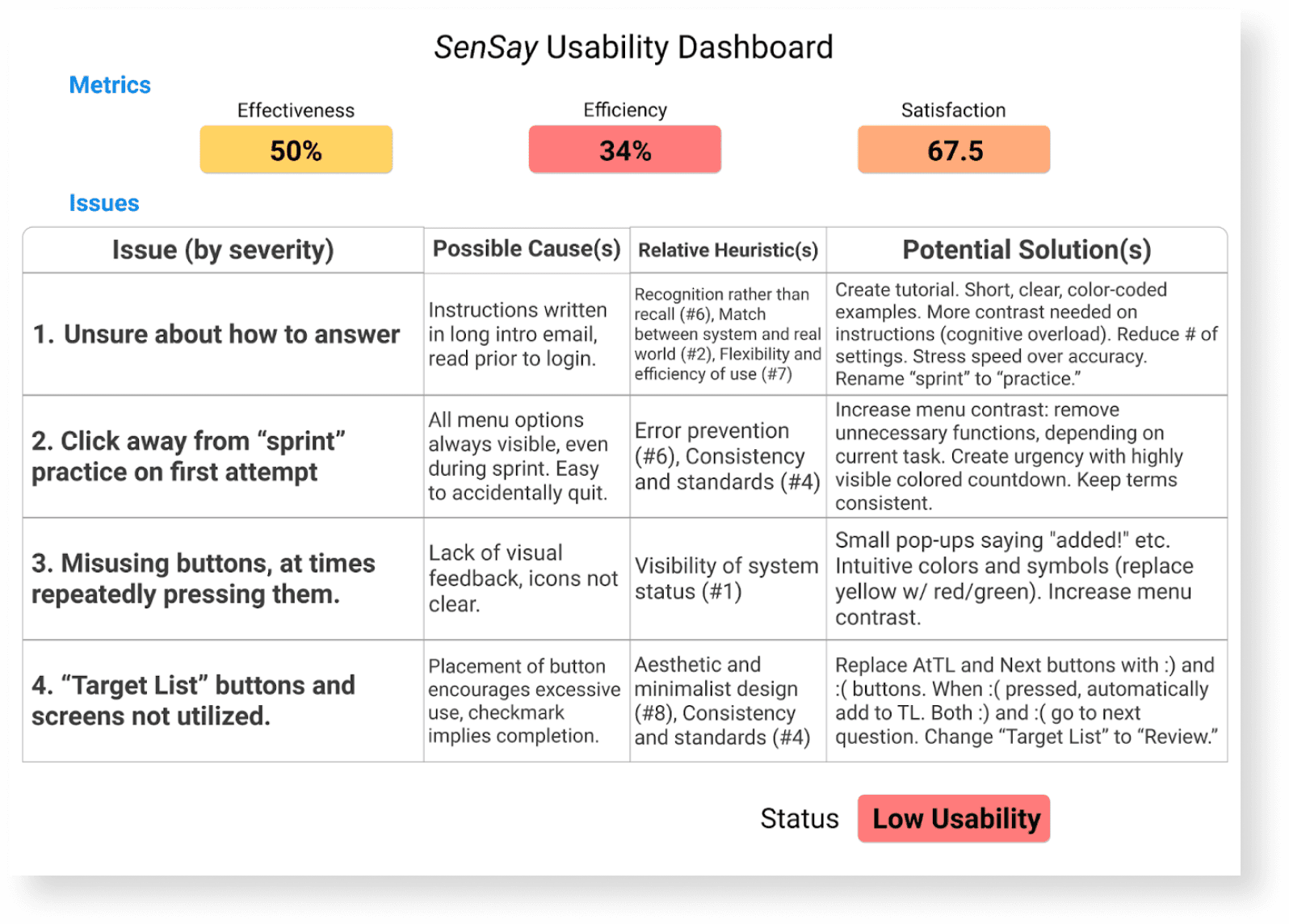
Issue #2 was one issue that was rated severe (3.75/5) due to its affecting completion rate. During the task, which asked users to complete one practice session, or “sprint,” 75% of users initiated a sprint and left it before completion (though some later returned to complete a new sprint). During debriefing, all users who made this error admitted that they did not realize they had begun a sprint.
Two possible causes of this were identified:
Inconsistency in terminology (“sprints” are initiated by clicking on “Start Self-Training”)
Ease of abandoning a sprint (main menu functions remained highly visible regardless of the current screen, even when in a timed practice session).Prioritizing
Ideation
In order to produce solutions to the issues outlined above, the following methods were used:
Brainstorm sessions
Small group meetings in which we tried to come up with solutions. Priority was give to power implementations--fixes that would solve multiple usability issues.
Storyboarding
Sketching out quick storyboards helped us get in touch with our users and attempt to see the usability issues through their eyes. This triggered a fresh set of ideas that we hadn’t come up with prior.
Competitor analysis
By looking at similar language-learning applications (like Duolingo and BlueCanoe) we were able to draw on industry standards and effective design concepts to guide us.
After the idea generation stage, we worked as a group to pick the solutions that had the potential to be the most efficient--in other words, the solutions that were quickest and easiest to implement, and would tackle multiple issues. We then put together lo-fi prototypes.
These prototypes were narrowed down and used to create hi-fi prototypes and wireframes. The following screen, displayed when users are conducting a sprint training session, underwent one of the more significant redesigns.
"Sprint" Screen
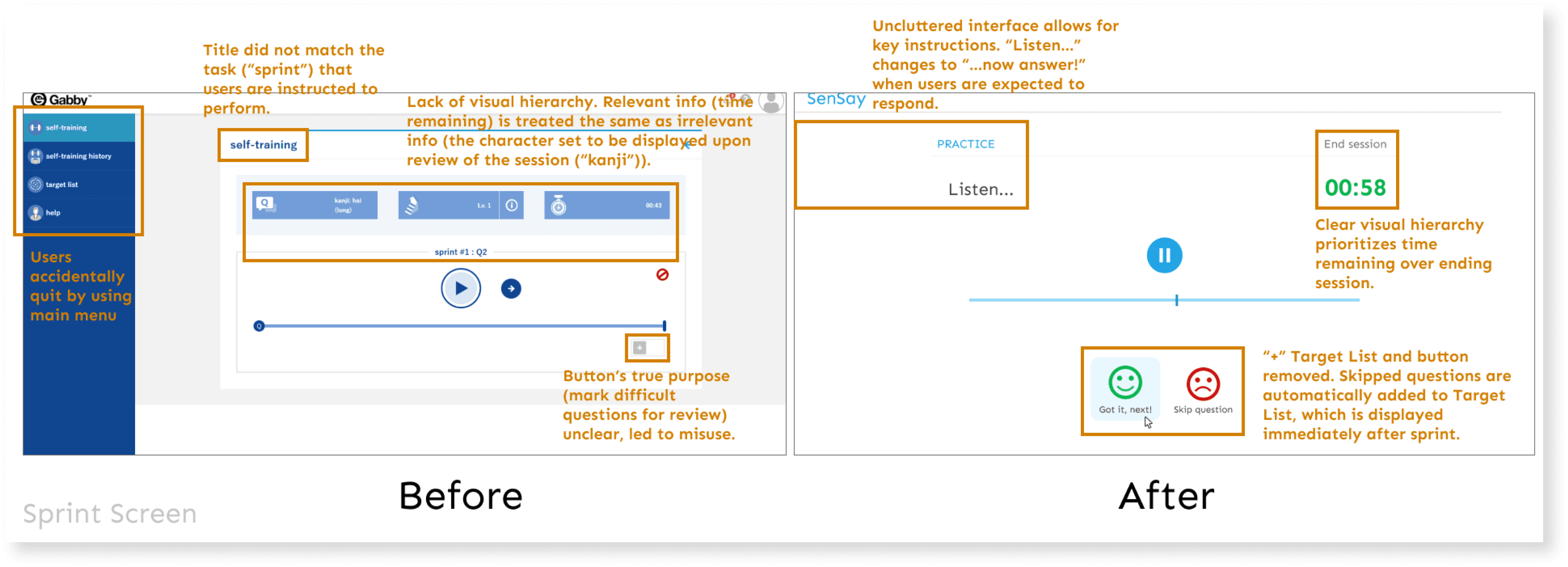
The “After” screen was designed with the following aims:
Remove ways to accidentally interrupt a session
Relieve users of unnecessary responsibility (create a “Target List” behind the scenes, compiled of user-skipped questions)
Enhance visual hierarchy
Reduce cognitive load on users
Settings Screen

Other issues, such as confusion about how to respond to questions correctly, were addressed in a similar manner. The sprint settings screen, displayed directly prior to a sprint beginning, was one such screen that took a lot of time for users to navigate, potentially contributing to confusion by presenting settings that were irrelevant to the task. Instructions were accessible by a small “i” icon that was not clicked on by any tested user. This screen received a massive simplification, and a tutorial with sample questions and answers was included for clarity, but only displayed once users advanced the screen:
Per Hick's Law, reducing the number of decisions a user has to make can increase system efficiency. The only crucial setting on this screen was choosing a level. It was therefore preserved, along with the ability to choose a question type, which is only available to users who have already completed a sprint at that level. This was done to ensure that users first learn how the system works before experimenting with advanced functionality.
Tutorial
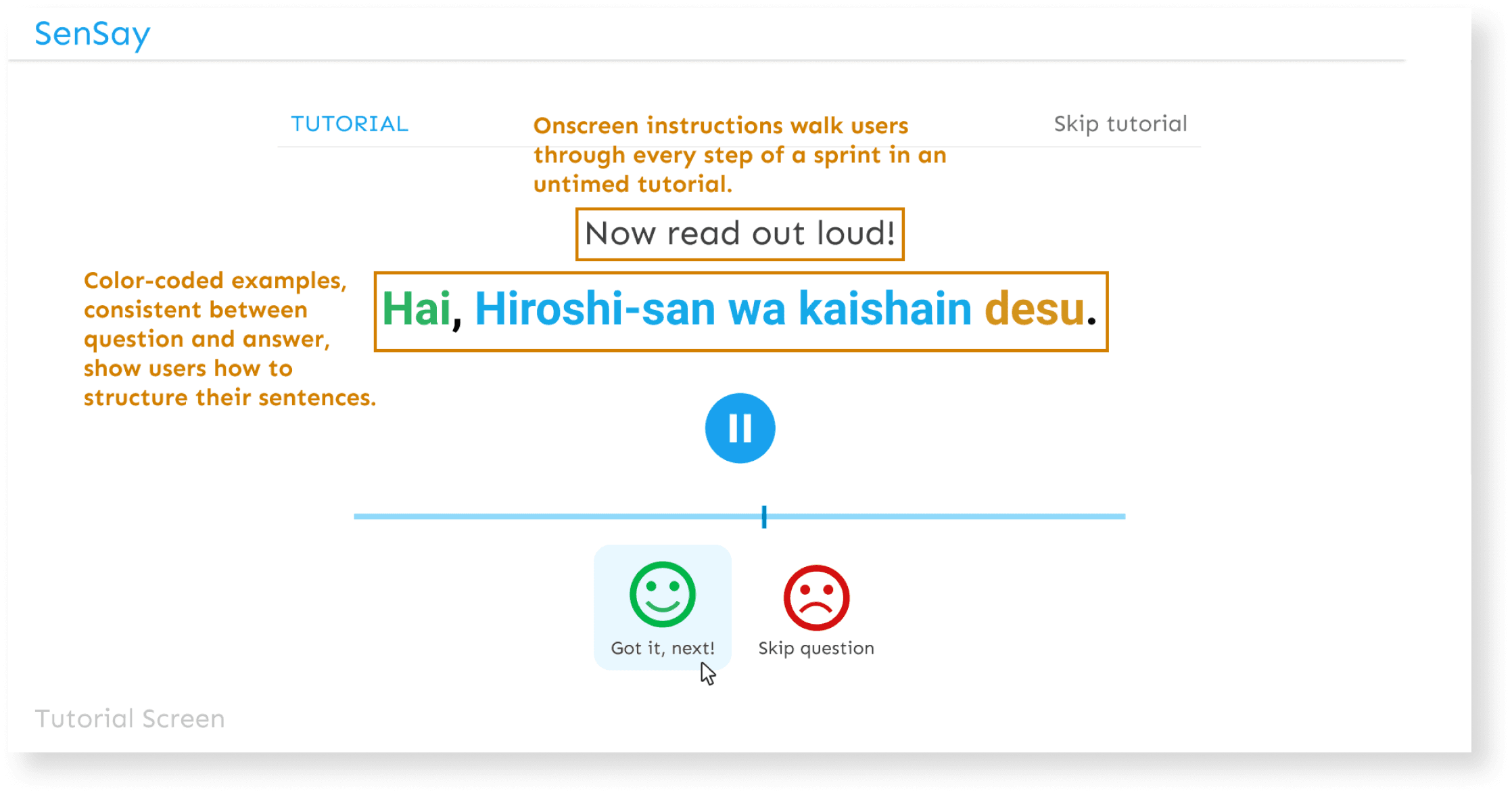
This tutorial was a new feature that was created to alleviate the issue of users being unable to answer questions appropriately.
A question is displayed, accompanied by an audio recording of the question. The same is then done for the correct answer. Colors are used to denote grammar, with text instructing users when to answer. Once the tutorial is complete and a user attempts a real sprint, the text is removed. Through this process, the grammar is taught inductively, rather than deductively.
This is a method commonly used in contemporary language education which encourages students to discover patterns in language for themselves. In contrast, the more traditional deductive reasoning provides rules for students to follow.
Future
System Flexibility
Norman's 7th usability heuristic recommends designing systems around novice user needs, with available expert functionality built-in. We saw how this can improve an interface’s aesthetic, while drawing attention to key user functions only.
Fostering UX Maturity
As this project was the first at our company to incorporate UX principles, my proposal for research and testing was initially met with skepticism. To get our directors behind the concept, I cited business strategy and KPIs. The proposal was eventually accepted on the basis that the cost and time required for testing and research were almost negligible compared to that of development, and that the current system was built without verification of its functionality.
Looking Ahead
The above prototypes underwent usability testing in 2021. Our goal was to look for significant improvements in the three usability metrics, then begin development during the summer of 2021 with an expected rebrand launch that fall.
Though I personally was not able to see this phase through, the lessons learned from this case study were quickly applied to other projects in our company, and their principles are now an integral part of the division’s development process.
Want to hear more?
Send me a message on LinkedIn and we can set up a call to talk about how this approach could work for your business.